Friday, May 12, 2017

Collecting UAS Data for a Wetland Near Tomah WI

Introduction

  The goal of this lab was to learn how UAS works in the business world. Professor Joe Hupy met with a business partner to fly over a wetland. The lab for this week took place at wetland near Tomah Wisconsin. Figure 12.0 is a a photo of what the wetland looked like. This land is not technically classified as a wetland currently, but it could be turned into a wetland. The area is being studied to see if this is possible. If it is, the property would then be sold to a large company such as Menards so that they could then turn it into a wetland.
Wetland Area
Fig 12.0: Wetland Area
Methods
  Fist, the GCPs had to be laid out across the wetland area. In total, 10 GCPs were laid out. The GCPs can be seen in the back of Professor Joe Hupy's pick up truck in figure 12.1. Then, the locations of these GCPs were taken using the survey grade GPS just like at the community garden at the middle school in Eau Claire. 

GCPs in the Back of the Pickup Truck
Fig 12.1: GCPs in the Back of the Pickup Truck
  Next, the launching pad for the Trimble UX500 was set up. This can be seen below in figure 12.2. It launches the Trimble UX500 which can be seen below on the right in figure 12.3. It costs around $ 25,000 when new.
Fig 12.3: Trimble UX500

Launching Pad for the Trimble UX500
Fig 12.2: Launching Pad for the Trimble UX500 


  After that, the Trimble UX500 was set up so that it was ready for flight. A tracker was inserted into the Trimble UX500 so that if it crashed for some reason the class could be able to find it. The mission was planned on its controller screen which can be seen below in figure 12.4. The overlap was set to 80% and the height was set to 400 feet.
Trimble UX500 Controller Screen
Fig 12.4: Trimble UX500 Controller Screen
  Then, the Trimble UX500 was ready for flight. Figure 12.5 is a short video which shows the launch of the Trimble UX500. The launch is quite quick, and the Trimble UX500 increases in speed very quickly. It can travel up to 55 mph and can fly in 30 mph winds. This flight took approximately 40 minutes and covered the whole wetland area.
Fig 12.5: Launch of the Trimble UX500 

  Next, The M 600 did a flight of the wetland. There were many issues encountered with the mission planning apps, but finally, Professor Joe Hupy got one to work. This flight took only about 20 minutes and was flown at 70 meters. The overlap used was unknown to author, but was set fairly high. After the M 600 flight  was complete, the GCPs were picked up.

Conclusion

  The skills learned in today's field day could be potentially useful when working in the job force. Learning how to get work done in a timely matter, learning to overcome issues, and learning how to communicate duties are things which will be used when working with other people in the field.


Monday, May 8, 2017

South Middle School Ponds and Garden Field Day

Introduction

  This lab was first time the class got out to actually fly some UAS platforms. The Phantom 3 Advanced was flown to collect nadir image data and oblique image data. Then, the DJI Inspire 1 was flown for fun so everybody in the class could get a a chance to fly it a bit. This lab took place at the community garden by South Middle School in Eau Claire. This can be seen below in Figure 11.0 in the study area map. 
Study Area
Fig 11.0: Study Area Map

  Figure 11.1 is a photo of what the community garden looked like. It mostly consisted of a flat dirt area. However, there were some miscellaneous items in the garden as well such as hay bales, bags of dirt, and tarps. There were no big obstacles because it was a garden, although a few plots were already planted in, so they had to be avoided. The weather conditions were not ideal as air temperatures were in the lower 50s and the wind was sustained from the NE around 10 mph.
Study Area Photo
Fig 11.1: Study Area Photo
  This lab also focused on learning how to use GCPs in the field by using survey grade GPS to collect the location of them.

Methods

Survey Grade GPS Unit
Fig 11.2: Survey Grade GPS Unit
  First, the GCPs created in last week's lab had to be laid out throughout the garden. They were laid out in a snake like pattern around the garden in order of their numbers so that it would be easier to keep track of each GCP when using the survey grade GPS unit. The survey grade GPS unit can be seen on the right in figure 11.2. In the photo, professor Hupy is teaching a student how to set up the GPS so that it is able to collect  the X,Y, and Z coordinates of the GCPs. The coordinate system used was the UTM WGS 1984 Zone 15N.
  Once the survey grade GPS unit was set up, it was fairly easy to record the X,Y and Z coordinates of the GCPs. All one had to do was press the button on the GPS screen which had the little surveyor man on it and then wait for the GPS unit to say that it was ready to collect data for the next point.
  The survey grade GPS unit needed WiFi in order to collect the data. This WiFi was provided by using a portable MiFi unit which can be seen below in figure 11.3.

Portable MiFi
Fig 11.3: Portable MiFi
 Level Used for Accuracy
Fig 11.5: Level Used for Accuracy
  While collecting the data, there were a couple things one needed to pay attention to before taking the survey point. First, one needed to be sure that the survey grade GPS unit was perpendicular to the earths surface. This was done by using a type of level included with the survey grade GPS. This can be seen on the right in figure 11.4. The bubble needed to be fully inside the circle for the GPS to be upright. Second, the data collector needed to make sure that the survey grade GPS unit was placed directly above the middle of the GCP so that the reading would be accurate. This can be seen below in figure 11.6. The placement didn't need to be perfect, but needed be within an inch or so.
Placement of the Survey Grade GPS Unit
Fig 11.6: Placement of the Survey Grade GPS Unit
  This process of collecting data using the survey grade GPS unit was done unit all 9 of the locations of the GCPs had been recorded.
  Next, it was time to prepare the Phantom 3 Advanced ready for flight. This included making sure the portable MiFi was nearby, updating firmware for the controller, checking the batteries for both the controller and the Phantom 3 Advanced, and planning the mission. The mission planning essentials learned in the Mission Planning Essentials lab were implemented here. The mission was planed by using the Pix4D Capture app on an I-Pad on site. Figure 11.7 is a photo of the Phantom 3 Advanced and its controller with the I-Pad attached. It is a small multi rotor UAS platform which costs around $800 when new.
Placement of the Survey Grade GPS Unit
Fig 11.7: Phantom 3 Advanced and its controller
    Then, the Phantom 3 Advanced was ready for its nadir mission. Professor Hupy took off manually and then did some circles and rotations to make sure everything was in good working condition. Then he pressed the button on the I-Pad to start the mission. The mission area was fairly small and only covered the community garden. The overlap was set fairly high around 80%, and the altitude was set to 70 meters. When it completed the mission, the Phantom 3 Advanced landed itself in roughly the same area it took off.
  Another mission was set up to collect oblique images of the all the students cars which were parked on the street. This flight was performed at a 75 degree oblique angle, and the altitude was set to 70 meters. The Pix4D Capture app was used to plan the flight again. Then, this mission was executed.
  Next, the DJI Inspire 1 was put up in the air. No data was collected with this platform. Once Professor Hupy got up in the air, the controller was passed around from student to student so that everyone could get a chance to fly it a little bit. Some people did circles, others tried to do figure 8's, and some people just swayed the Inspire back and forth.
  

Results / Discussion

  The data collected from the Phantom 3 Advanced flights were not made available in time for the author to process the data. Fortunately, very similar data was collected the next day in the same location in the Field Methods lab using the same GCPs but with the M600 UAS platform. This flight took nadir imagery of the community garden and the surrounding ponds. The data from this flight was processed just as laid out in the Using GCPs to Process UAS Data In Pix4D lab. Then, two maps were created from the DSM and Orthomosaics The first map is shown below in figure 11.8 which displays the orthomosaic of the middle school garden area. 
Orthomosaic of the M600 Flight
Fig 11.8: Orthomosaic of the M600 Flight
  This is a very high resolution image. The different plots in the garden can be identified, the location of cars can be found, and the placement of people can even bee seen. There are three main areas in the map: the north, the south, and the east. The north area is where the garden is. The trees here have leaves on them, but the grass is mostly bare. In the south region, this is where the two ponds are located. The vegetation here is mostly brown short and tall grass. The east region is where the parking lot and baseball field is located. Here the grass is a little greener, and this is where most people park their cars.
  This next map shown below in figure 11.9 displays the DSM overlaid with the hillshade of the M600 flight. The DSM was set to have 40% transparency so the hillshade can be seen beneath it. The hillshade scale is a grayscale so its legend isn't displayed because its values would be worthless. The hillshade is used in this map to help visualize the elevation differences. 
DSM Overlaid With a Hillshade
Fig 11.9: DSM Overlaid With a Hillshade
  Looking at the north, south, and east regions in this map some trends can be found. For the most part, the south region has the lowest elevation. This makes sense as this is where the ponds are located. The north region has a higher elevation than the south region, but a lower elevation than the east region. The east region has the highest elevation of the three regions. These elevation trends make sense as they relate looking at the surroundings in the orthomosaic. The south region contains two water ponds. This makes sense as water is generally located at a lower elevation than its surroundings. The parking lot and the baseball field have the highest elevations probably so that water doesn't pool up in these area when it rains hard. 
  There are a couple of places in the map where the elevation values are not super accurate. This is because there were some trees which cause havoc when trying make the DSM look nice. The camera used on the M600 can only take the elevation of the surface, not the ground. Therefore, objects such as trees and buildings will cause there to be abrupt changes in the DSM values. The minimum value in the map is 264.2 meters which is located in one of the two ponds. The maximum value is 283.3 meters which is located on the tops of the trees either in the southwest corner of the map, or in the northern part. The average surface elevation is 273.8 meters which is displayed as the yellow color. This elevation covers most of the roadways and parking lot.

Conclusion

  In conclusion, the processes of using GCPs and collecting nadir and oblique image data was implemented. Survey grade GPS is a good tool to use to gather very accurate  X,Y and Z data down to the inch which makes it perfect for collecting the location of GCPs. Learning how to use survey grade GPS is important because there are many other application of it. These include construction, utilities, or property surveying. The only downfall of survey grade GPS is that its expense. The one used for this lab costed north of $12,000.
  The Phantom 3 Advanced was a perfect fit for the size of its flight. It was also good to get a little hands on experience using the DJI Inspire 1. The Inspire was up fairly high and was GPS assisted which made it very difficult to crash it. It was also important to learn how to use the Pix4D Capture app for planning the mission. This app is much faster than the C³P software and can be used right in the field.


Sunday, April 30, 2017

Crafting GCPs

Introduction

  This lab consisted of creating GCPs which will be used in the field for future labs. The materials used to create the GCPs include a heavy hard plastic, spray paint, canvas cloths, a plywood stencil, and a table saw. To make the GCPs, first the heavy plastic material was cut into about 2 ft by 2 ft squares using the table saw. Then, the plywood stencil was used to create a bright pink "X" on the GCP so it easily identified when processing the imagery. After the "X" was painted on, or when at least half of the "X" was painted on, then a number was painted on the GCP using a bright yellow spray paint. Lastly, time was allotted to allow the paint to dry.
  Below are some pictures taken while creating the GCPs. The GCPs were created in Professor Joe Hupy's garage. In total, 16 GCPs were created, and about one hour was taken to make them.
Example of a GCP before painting
Fig 10.0: Example of a GCP before painting
GCP with half of the "X" painted
Fig 10.1: GCP with half of the "X" painted
Painting on the numbers
Fig 10.2: Painting on the numbers 
Allowing the GCPs to dry when finished
Fig 10.3: Allowing the GCPs to dry when finished


Sunday, April 23, 2017

Mission Planning Essentials

Introduction

  The goal of this lab is to become familiar with the C³P mission planning software and other mission planning essentials. These essentials will be covered, altitude settings will be discussed, and an overview of the C³P software will be given. A few main missions will be created, two in the Bramor Test Field area, and one in downtown Minneapolis. Issues with the C³P mission planning software will also be addressed. Then, an overall review of the C³P software will be given.

Mission Planning Essentials

Prior to Departing
  Before departing, it is good to learn about the study site. Will there be hilly terrain, radio towers, cell towers, thick vegetation, crowds of people or other obstacles? These obstacles must be taken into account before starting the mission. Some of these obstacles may prevent the mission from taking place. For example, it is illegal to flight UAS platforms over large crowds of people. Before departing, it is also important to check to make sure that batteries are charged, that equipment is is working condition, and that all necessary equipment is accounted for. Lastly, one should check the weather before departing to make sure that mission day is a fair weather day. When checking the weather it is most important to look at precipitation and wind forecasts.

In the Field
  Before deciding on a home, takeoff, rally, and landing point, the weather conditions must be checked. These include, wind speed, wind direction, temperature, and dew point. It is important to take off into the wind and to land with the wind. The vegetation, terrain, and man made features must also be assessed. The elevation of the launch site is important to know, because often UAS platforms will be flown at an absolute height above the launch site. Because GPS units are used for the flying of the UAS platforms frequently, it is important to make sure to stay away from objects which could emit electromagnetic waves. These could include power lines, power boxes, and underground cables. The units used should be standardized. Mixing between the English and Metric system increases the chance for error to occur. Lastly,  one needs to make sure that the study area has a good GPS and cellular signal.

C³P Mission Planning Software

  
Working with the Software
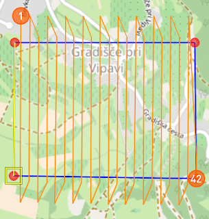
    Creating a mission in C³P begins with moving the home, takeoff, rally, and land locations depending on the study area and the weather conditions. Then, a flight path is drawn using the Draw feature. This gives one the option to draw the path point by point, by area, or by line. The Draw by Area feature is the most commonly used. The missions settings then should be changed, which is discussed below. The mission can then be viewed in the 2D map which the C³P software provides or in in 3D through ArcGIS Earth or Google Earth.
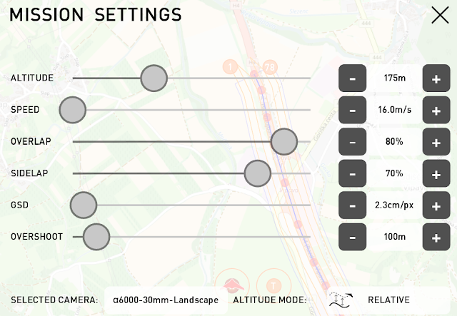
  For this lab, three main missions were created. The first mission took place in the Bramer Test Field. This is where the C³P software defaults the user to. the C³P allows one to control the mission settings which can be seen below in figure 9.0. It also allows the user to move the takeoff, home, rally, and landing locations. These are represented by T, H, R, and I  orange circles respectively. The mission settings allow the user to alter the altitude, speed, overlap, sidelap, GSD, overshoot, camera type used, and the altitude mode of the mission. Generally, the altitude should be a comfortable distance above the highest object one is expected to encounter, the speed should be around 16 m/s to 18 m/s, the overlap should be at least 80%, the sidelap should be at least 70%, the GSD (pixel resolution) is usually left to the default, and the overshoot ( space for the UAS platform to correct itself when turning around) can be chosen based on the study area.
Mission Settings
Fig 9.0: Mission Settings

Critical Altitude Settings: Height, Orientation, and Mode

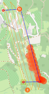
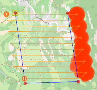
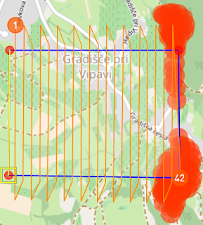
  To show the difference between altitude height, altitude mode, and flight orientation, 6 mini missions were created roughly covering the same areas. Relative altitude mode means that the UAS platform will always flight a certain height relative to the surface. Absolute altitude mode means that the UAS platform will always fly at the same altitude no matter how the terrain changes. Flight orientation refers to the direction the UAS platform is flown relative to obstructing terrain. All of the six mini missions use the draw area points feature. The T, H, R, and circles are not shown in any of these missions because the point of these figures is to show the differences between certain settings. Besides terrain, altitude settings will need to be chosen based off of what anthropogenic features there are in the study area such as radio towers, cell towers, buildings, and other infrastructure.
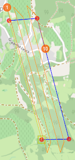
  Figures 9.1 and 9.2 show the difference between using different absolute altitudes. Figure 9.1 has an flight altitude of 200 m, and figure 9.2 has a flight altitude of 175 m. All of the the other mission settings remained the same. Notice how figure 9.2 has red circles in the flight zone. This indicates that the UAS platform will crash if it is flown at that height. The red circles indicate that the UAS platform needs to flown at a higher altitude.
200 Meter Flight
Fig 9.1: 200 Meter Flight
175 Meter Flight
Fig 9.2: 175 Meter Flight


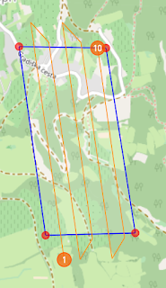
  Orientation also affects flight planning. The difference between parallel and perpendicular orientation is shown below in figures 9.3 and 9.4. Figure 9.3 uses parallel orientation which goes with the hilly terrain and figure 9.4 uses perpendicular orientation which goes against the hilly terrain. Both areas roughly cover the same area, but the flight in figure 9.3 would be successful and the flight in figure 9.4 would not. Simply put, the UAS platform would hit something in the flight path in figure 9.4. This is because the UAS platform is instructed to turn around on the large hill. The flight in figure 9.3 would be successful because the flight path doesn't make the UAS platform turn around on the hill. It goes parallel with it instead.
Parallel Orientation
Fig 9.3: Parallel Orientation

 Perpendicular Orientation
Fig 9.4: Perpendicular Orientation


 Altitude mode also affects mission and flight planning. The difference between using relative and absolute altitude mode can be seen between figure 9.5 and 9.6, the altitude set in the mission settings for both is 140 m. Because the relative altitude mode changes the absolute altitude of the UAS platform in the flight in figure 9.5, it would be a successful flight. Figure 9.6's mission would not be successful because the absolute height of the UAS platform wouldn't change throughout the flight depending on the terrain. Therefore, when the UAS platform encounters a hill it would crash right into.
Relative Altitude Mode
Fig 9.4: Relative Altitude Mode
Absolute Altitude Mode
Fig 9.5: Absolute Altitude Mode


Planning Missions
 Figure 9.6 shows a mission created with the software. It uses the Draw Street Points feature to plan out the route along a road near the Bramer Test Field. The wind in this mission is coming from the east at about 3.6 m/s. The takeoff and landing zones are placed so that the UAS platform will takeoff into the wind and land with it. The takeoff and landing zones should be located in safe areas. They should not be located in the same area! If they are, the UAS operator and other spectators run the risk of  getting injured because often the UAS is controlled from the home and launch site. One should also be careful to locate the landing area away from expensive objects such as cars. C³P, missions can also be displayed in 3D in ArcGIS Earth or Google Earch. The 3D mission for this one is shown in figure 9.7 using ArcGis Earth. The 3D view allows the user to see the surrounding terrain and vegetation near the mission site.
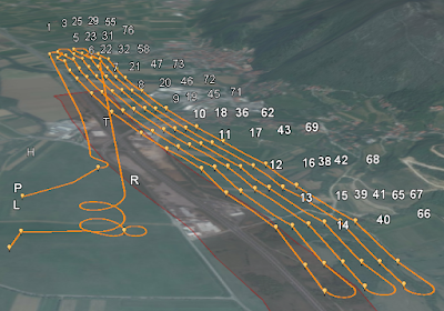
3D  Road Sample Mission
Fig 9.7: 3D  Road Sample Mission
2D Road Sample Mission 
Fig 9.6: 2D Road Sample Mission


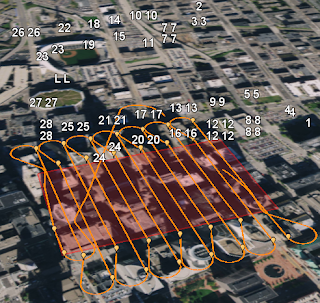
  Another mission was created in downtown Minneapolis. This is shown below in 2D in figure 9.8 and in 3D in figure 9.9. The altitude for this flight is an absolute 140 m. This flight is completely illegal. The home and launch site is located in the outfield at Target Field, the mission flight area is all around very tall buildings in downtown, and the landing site is located on the roof of Target Center. The wind speed an direction is the same as in the previous sample mission.
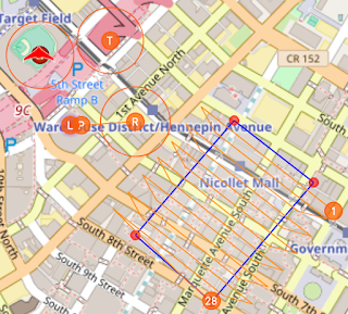
Fig 9.8: Downtown Minneapolis Mission
Fig 9.9: Downtown Minneapolis Mission


 An error with the C³P software has been discovered. In North America, the software will not tell the user if the flight will be successful or not. Many of the buildings in downtown Minneapolis are taller than 140 meters, yet there are no red circles in the 2D map indicating that objects will be hit. Also, the 3D map isn't 3D at all. The downtown buildings appear flat with the surface. This causes the software to think that the missions will be successful when it would be a complete failure. This kind of mission planning could potentially be misleading and dangerous.

Review of C³P Mission Planning Software

  Overall, I found the C³P mission planning software to be very useful for planning missions. It even allows for simulation. I did a simulation which really helped me to understand all of the way points (home, takeoff, rally, land, and navigation) and how a mission works. In the beginning, I had to use the help quite a bit which was really useful. The help provides a whole tutorial to setting up a mission. The amount of information which the software is capable of providing is very nice. Being able to account for weather conditions, battery life, altitude and other information makes this very valuable software package. The measure tool is also handy because its a quick way to measure the distance between certain points.
  The downside to this mission planning software is that missions planned in North America cannot be totally depended on. This was shown in the mission located in downtown Minneapolis. This is a good reminder that technology isn't always to be trusted. People must do their own planning as well as using the mission planning software.

Monday, April 17, 2017

Processing Oblique UAS Imagery Using Image Annotation

Introduction

  There are two main types of UAS imagery: nadir and oblique. Nadir UAS imagery is taken perpendicular from an object. This is how most aerial images are taken. In UAS, these photos are most commonly used to create orthomosaics and DSMs. This is the kind of imagery which has been used for previous Geog390 UAS labs. In this lab, oblique imagery will be used. Oblique imagery consists of photos taken at an angle that is not perpendicular from an object. The most common angle is 45°. Oblique imagery allows for 3D modeling where the sides of objects can be measured because oblique pictures area taken all around the object. Common market uses of oblique imagery include emergency management, community planning, and property assessment situations (AIMS).

Methods

  For this lab, there are three sets of oblique imagery which will be used to create 3D models of objects. In previous labs, the 3D maps template was used, but because there is oblique imagery in this lab, no maps with orthomosaics or DSMs can be created. Thus, the 3D Model template will be used. The first study area is at the Litchfield frac sand mine located just southwest of Eau Claire along the Chippewa river. This imagery captured a bulldozer. Other lab data has been collected at this location. The other two sets of oblique imagery are from South middle school located in the southern part of Eau Claire. The second set of imagery captures a storage shed near the athletic fields, and the third set captures a pickup truck in the parking lot. All three oblique imagery sets were taken in a corkscrew like fashion starting from the ground and working up in altitude.
  Annotation will also be used in this lab. Annotation is a tool used in Pix4D after initial processing to remove unnecessary objects in each individual photo. There are three types of annotation: mask, carve, and global mask. Mask is used to rid of unwanted background objects and objects which occur in a few photos which overlap the main object which the 3D model is being created for. Carve, is used to remove the sky. Lastly, global mask is used to delete overlapping objects on the main object which occurs in almost all the photos. For this lab, only the mask tool will be used, even though the carve tool is specifically to remove the sky, the mask tool can do this as well. The data for this lab will also be processed without any annotation to draw comparisons between using annotation and not using annotation.

Image Set One: Bulldozer at the Litchfield Frac Sand Mine
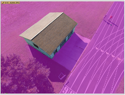
  The first step is to do the initial processing. After that, a copy of the Pix4D file was created so that the data could be processed with and without annotation. Then, images are ready for annotation. Below, figure 8.0 is one of the 5 images that were annotated using the mask template. To annotated the image, the pencil was clicked on in the upper right part of the figure. The template can then be changed in the lower right of the figure if necessary. The down arrow to the right of the mask template provides the options of mask, carve, and global mask.
Fig 8.0: Annotated Bulldozer Photo
  The data was then re-optimized using the annotation and then was further processed using the 5 annotated images with Point Cloud and Mesh processing. This created the 3D model using all of the images. Lastly, the file copy, created before annotating, was used for Point Cloud and Mesh processing.

Image Set Two: Storage Shed at South Middle School
  The same process used for the bulldozer is used for the storage shed. First. the initial processing was done, then a copy of the Pix4D file was created. After that, annotation was used to highlight the areas not wanted in the 3D model which can be seen below in figure 8.1. Lastly, a re-optimize was done using the annotation and the Point Cloud and Mesh processing was ran using annotation on the main file and on the copy file without using annotation.
Fig 8.1: Annotated Storage Shed Photo

Image Set Three: Pickup Truck at South Middle School
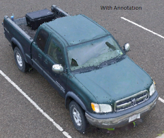
  The same process used for the bulldozer and storage shed is used for the pickup truck. First. the initial processing was done, then a copy of the Pix4D file was created. After that, annotation was used to highlight the areas not wanted in the pickup truck's 3D model which can be seen below in figure 8.2. Lastly, a re-optimize was done on using the annotation and the Point Cloud and Mesh processing was ran using annotation on the main file and on the copy file without using annotation.
Figure 8.2: Annotated Pickup Truck

 Results / Discussion

  A fly by video for all three 3D models using annotation were created. The bulldozer video can be seen in figure 8.3, the storage shed video can be seen in figure 8.4, and the pickup truck video can be seen in figure 8.5. These videos are a good visual of the 3D models.

Fig 8.3: Bulldozer Flyby Video

Figure 8.4: Storage Shed Flyby Video
Figure 8.5: Pickup Flyby Video
Bulldozer
 To create comparisons between using annotation and not using annotation, .png files were created with roughly the same resolution. These were of the the final 3D model produced with and without annotation. The bulldozer image without annotation can be seen in figure 8.6, and the bulldozer image with annotation can be seen in figure 8.7.

Fig 8.6: Bulldozer Model Using Annotation
Fig 8.7: Bulldozer Model Without Using Annotation
  Unfortunately, there isn't ant significant difference seen here between using annotation and not using annotation. This is likely because the images taken were already fairly clean in that there were no unwanted objects overlapping the bulldozer. As seen in the figures above, both models had a very poor data quality area in the scoop of the bulldozer. This is probably because this area is enclosed from three directions and the camera can only capture it in the front. Overall, the bulldozer's 3D models produced with and without annotation was of good quality and didn't have any major issues.

Storage Shed
  Next, a comparison was done between the 3D model of the storage shed with and without annotation. These can be seen below in figures 8.8 and 8.9 respectively.
Fig 8.8: 3D Model of Storage Shed Using Annotation

Fig 8.9: 3D Model of Storage Shed Without Using Annotation
  Much like the bulldozer, there is really no difference between the models because there were no unwanted overlapping objects on the storage shed. There is a little difference on the top of the shed where poor quality is present. On the actual shed by South Middle School, there is not random plume on the top of the shed. The reason for this poor quality is unknown. However, both models experienced this issue. The other main issue is the random discolored pixels present in both models. The reason for this is also unknown, but could be because there weren't enough images taken of the shed.

Pickup Truck
  Lastly, a comparison is done between the 3D models of the pickup truck with and without annotation. An image of the the model with annotation is displayed in figure 8.10, and an image of the model without annotation is displayed in figure 8.11.

Fig 8.10: Pickup Truck Model With Annotation
Fig 8.10: Pickup Truck Model Without Annotation
  Just like the bulldozer and storage shed comparisons, there are really no major differences between using annotation and not using annotation present in the pickup truck models. Not shown in the images, but present in both models was poor representation of underneath the tailgate of the pickup truck. This can be seen in the flyby video in figure 8.5. It is a similar to the error that occurred in the scoop of the bulldozer. It happened to both models because the imagery taken in these spots was at a very sharp angle which doesn't allow for much depth perception from the camera.

Conclusion

  Although annotation wasn't necessarily needed for the oblique data sets used in this lab, many times it is. Oblique imagery can be used to create 3D models of objects as demonstrated in this lab. Based off the results from the pickup truck and the bulldozer, it seems that oblique imagery is most difficult to process when there is an object overhanging the desired model area. This happened in the bulldoze and pickup truck models where the tailgate was overhanging the ground and the scoop was overhanging itself. The flight path for taking oblique imagery should be decided based on the area surrounding the object. If there are no objects in the way of the desired object, then a corkscrew patterns starting from the ground and working up should be used just like the image pattern for the 3 oblique image sets for this lab. If there are many objects in the way, a different image aquisition pattern will have to be used.

Sources

AIMS (Automated Information Mapping System), Oblique Imagery
  http://aims.jocogov.org/AIMSData/Oblique.aspx
Pix4D Help, How to Annotate Images in the Ray Cloud
  https://support.pix4d.com/hc/en-us/articles/202560549-How-to-Annotate-Images-in-the-rayCloud#gsc.tab=0


Sunday, April 9, 2017

Calculating Volumes of Sand Piles Using Pix4D and ESRI Tools

Introduction

  Volumetric analysis is the process of calculating the volume of objects using software. It can be used to calculate the volume of buildings, mine piles. river valleys, canyons, and more. To calculate the volume of an object using volumetric analysis x,y, and z values are needed. They do not need to be coordinates and elevation. They can be cartesian values. UAS data is a great source to perform volumetric analysis on. Processing imagery through Pix4D creates an orthomosaic and a DSM. The DSM contains elevation values which can be used to calculate volume. Volume measurements can be very accurate and precise when using UAS imagery, especially if GCPs were used.
  In this lab the volume of three sand piles chosen from the Litchfield sand mine will be calculated using Pix4D, 3D analyst tools, and TIN tools. The tools used for the 3D analyst method include Extract by Mask and Surface Volume. For the TINs, the tools used include Raster to TIN, Add Surface Information, and Polygon Volume. After calculating the volumes of the sand piles, a table and a map of the average volume values will be created. The difference between the methods and values will then be discussed.

Methods


Use Pix4D to Calculate Volumes
  To do this, the Litchfield Mine GCP project was opened. Then, the volumes tab was used to create a polygon around the three sand piles. After that, the volume was calculated. Piles two and three are shown below in figure 7.0. Their calculated volumes can be seen in the left part of the image. Pile one's calculated volume is 1086.17 m³, pile two's calculated volume is 18.59 m³, and pile three's calculated volume is 32.20 m³.
Fig 7.0: Using Pix4D to Calculate Volumes for Sand Piles 2 and 3.

Use a DSM Clip to Calculate Volumes
  First, three different feature classes needed to be created in ArcCatalog and edited in ArcMap so that the DSM could be clipped to only the area needed to calculate the volume. These were name Pile1, Pile2, and Pile3. Then, the Extract by Mask tool was used to clip the DSM to the corresponding feature class. The Extract by Mask tool is used to clip a raster (the DSM) to a specific feature class (Pile1, Pile2, or Pile3)  or a different raster dataset. After this, the Surface Volume tool was used to calculate the volume of the three sand piles. The Surface Volume tool calculates the volume based off a specific surface. In this case, the volume wanted is the area above the lowest value of the DSM clip for each sand pile. Using this method, the calculated volumes were 1191.85 m³ for pile 1, 23.76 m³ for pile 2, and 48.04 m³ for pile 3. 

Use a TIN to Calculate Volumes
  For this, the three DSM clips were converted to TINs using the Raster to TIN tool. This tool creates a TIN based on an input raster. Then, the Add Surface Information tool was used to add the minimum elevation value (Z-Min) to the TINs. These minimum elevations values were imported from the DSM clip features. In general, the Add Surface Information creates a new feature class which imports information into its attribute table. After the Z-Min value feature class was created for each pile, the Polygon Volume tool was used to calculate the volumes. This tool used both the TINs and the Z-min feature classes. The Polygon Volume tool is ordinarily used for calculating the volume and surface area between a polygon feature class and a TIN. After doing this for each pile, the calculated volumes were 1202.46 m³ for pile 1, 24.31 m³ for pile 2, and 48.96 m³ for pile 3.

Results / Discussion

  While calculating the volumes of the sand piles using the different methods, the results were entered into an Excel spreadsheet. This can be seen below in figure 7.1. An average and standard deviation field were also added. Overall, all three methods seemed to be within reasonable accuracy of each other. The TIN and 3D analyst methods churned out extremely similar results with the Pix4D volumes having lower values across all three piles. Looking at the difference in the calculated volumes for each pile, it seems that the difference between the methods grow as the size of the sand pile increases. For example, there is a greater difference between the volumes of pile 1 across the three methods than there is between the volumes of pile 2. This is probably because each method is consistent in the way it calculates the volume so larger pile volumes are going to differ more than smaller pile volumes.
Sand Pile Volume Table
Fig 7.1: Sand Pile Volume Table

  A map was created showing the locations of the sand piles and the average calculated volumes using the three different methods. This map is shown below in figure 7.2. Because of the table in figure 7.1, there aren't any surprises in the map. By far, pile 1 is the largest pile by both area and volume. Piles 2 and 3 are similar in surface area so they have more similar volumes.
 Average Sand Pile Volume Map
Fig 7.2: Average Sand Pile Volume Map


Conclusion

   In conclusion, UAS imagery can be used to calculate volumes in at least three different ways. It is interesting to see how similar the 3D analyst and the TIN calculated volumes area. These values are very close to each other because the TINs were derived from the DSM which was used to calculate the 3D analyst volume. The volumes calculated in this lab could be used by the mining company to see how much sand is left in the piles and to see how much time they have before they need to replace the pile with more sand. Volumetric analysis is a much more efficient and cheaper way to get this estimate than actually measuring the pile.  Based off of the three methods in this lab, no conclusion can be made seeing which method is the most accurate. Even though the 3D analyst and TIN methods were similar, that doesn't mean that those methods are more accurate than using Pix4D. A comparison between the actual volume of the sand piles and the calculated volumes using each method would need to be done to test the accuracy.

Monday, March 27, 2017

Processing Multi-Spectral UAS Imagery

Introduction

  The images taken for this lab were done so using a Red Edge Sensor. A Red Edge Sensor is a camera which captures five distinct bands: Blue, Green, Red, Red Edge, and Near Infrared (NIR). A typical RGB sensor only captures three bands: Red, Green, and Blue. This makes the Red Edge Sensor very useful for added data analysis. Some of the important parameters for the Red Edge's camera lens include its focal length which is 5.5mm, its lens field of veiw which is 47.2° HFOV, its imager size which is 4.8 mm by 3.6 mm, and its imager resolution which is 1280 by 960 pixels. The Red Edge and NIR bands are extra bands which an average RGB sensor doesn't have. The proper order of these bands starting with band 1 is Blue, Green, Red, Red Edge,and NIR. The NIR, and Red Edge bands can be used to help create very precise quantitative data along with qualitative data. This lab will focus more on the qualitative analysis. Red Edge sensors are commonly used for vegetation health analysis. The purpose of this lab is to process UAS imagery and then to classify this imagery between permeable and impermeable. A series of maps will be created showing the false color NIR, false color Red Edge, RGB, and permeable versus impermeable surfaces. These maps will then be discussed as they relate to the Red Edge sensor.

Methods

Process the UAS Imagery
 First, the images had to be processed using Pix4D. A title was given to the project, 20160904_FallCreek, and the images from the lab folder were added.  Before processing the data, some of the usual options had to changed. These include choosing the Ag-Multispectral Processing template instead of the 3D model template, checking on GeoTiff, and GeTiff without transparency in the processing options. After the initial processes was complete, a quality report was generated shown below at left in figure 6.0. The quality check section shows that only 69% of all the images were calibrated. This is because the images were being taken as the Phantom was taking off. The area actually had good coverage by the Phantom as shown in figure 6.1 below at right in the overlap section of the quality report.


 Quality Report for Initial Processing
Fig 6.0: Quality Report for Initial Processing
Overlap Section in the Quality Repor
Fig 6.1: Overlap Section in the Quality Report


  After reviewing this quality report. The data was ready for further processing. Once the Point Cloud and Mesh, and DSM, Orthomosaic and Index processing was complete there were a series of geoTiffs with the different bands specified (Blue, Red, Green, NIR, and RE) in the Fall Creek folder.

Create a Composite Image
  To create maps overlaying the different color bands, a composite image was generated. This was done by using the composite bands tool in ArcMap. For the input bands, all five of the bands are added in the following order: Blue, Green, Red Edge, and Near Infrared. The composite bands tool is used to create a new raster dataset with the bands aligned in a specific order. Once these bands are assigned a band number, they can be reordered and outputted through different band channels. This is how the RGB, False IR, and Falsue RE maps will be constructed.

Classify the Imagery Between Permeable and Impermeable
  Next, the image surfaces were classified between permeable and impermeable. This was done using a process very similar to the one used in the Using ArcPro and UAS data to Calculate Impervious Surface Area lab. To do this, first, the RGB composite had to be segmented using the Segment Mean Shift tool. This was used to generalize the image to help rid of unnecessary pixels. The segmented image is shown below in figure 6.2. This helps to make it easier to distinguish what surfaces are permeable and what surfaces are impermeable.
Segmented Image
Fig 6.2: Segmented Image
   After that, the Training Sample Manager was used to create help classify the image. This was done by creating a series of rectangles on the roof, pavement, grass, shadows, and other areas and then labeling them appropriately. The use of the Training Sample Manager can be seen used below in figure 6.3. Once the rectangles were finished they were saved as a separate shapefile.
Using the Training Sample Manager
Fig 6.3: Using the Training Sample Manager
  Lastly, the Classify Raster tool was used to apply the training samples to the whole image. This would classify each part of the image between the categories specified in the training samples. Then, some of the categories were grouped together to create a impermeable and permeable surface distinction.

Results/Discussion

 Maps
  This first map shown below in figure 6.4 is the RGB composite. This map looks very much like an aerial orthomosaic. RGB is the way which our eyes see the spectral bands, so this image looks "normal". In the image there are four main features. The first is the road in the western part of the map. The second is the house and the driveway immediately surrounding it. The third is the brownish green vegetation south of the house. The fourth is the greener vegetation north of the house.
RGB Composite Map
Fig 6.4: RGB Composite Map
 This next map in figure 6.5 shows a false color NIR of the area. This map has the bands arranged in the order: NIR, Red, and Green. Doing this makes the image a mix between red and blue hues. The healthier vegetation is represented by the darker shades of red, and the areas which have no vegetation are represented by the blue hues. This map does a good job of showing the density of vegetation. This can be seen by comparing the western edge of the map with the southern part of the map. In the western edge is a crop field full of crops and the southern part is just a grassy field which isn't very dense.
False NIR Map
Fig 6.5: False NIR Map

  This map, shown below in figure 6.6, shows a false color Red Edge. It is very similar to the false NIR map in that it uses red and blue hues. However, the blue hue in this map is much more gray-like. The bands are arranged in the following order: Red Edge, Red, and Green. The patterns found in this map is identical to the ones found in the False NIR map.
 False Red Edge Map
Fig 6.6: False Red Edge Map

  This last map, shown below in figure 6.7, shows the permeable and impermeable surfaces. The permeable surfaces are shown in green and the impermeable surfaces are shown in light blue. Generally, the impermeable surfaces are where the roof, driveway, and road is, and the permeable areas are where the vegetation is. However, there are some impermeable surfaces embedded in the vegetation areas. This is because some of the pixels which were classified in the training samples were similar enough to some of the pixels in the composite to where it classified it as impermeable. One minor error in this map is that the outer area which surrounds the image. When classifying the the image, this was classified as impermeable. In future similar maps and analysis this area should be left out all together. For the purpose of this map, it can simply be ignored as the light blue was chosen so that it would match in with the background color, but be in contrast with the important permeable surface areas.
Permeable and Impermeable Surfaces Map
Fig 6.7: Permeable and Impermeable Surfaces Map


Red Edge Senor and Data Analysis
  These maps would not be possible if it were not for the Red Edge sensor. The Red Edge sensor allows for the capturing of 5 bands: Red, Green, Blue. NIR, and Red Edge. The two extra bands (NIR and RE) can be used to monitor vegetation health. This could be applied in a market setting to determine the health of a crop field and identify areas which need more water to grow healthier crops. Although only qualitative analysis is present in this lab, quantitative analysis is possible. An example of quantitative analysis would be to calculate the amount of impermeable surface area versus the amount of permeable surface area.

Conclusion

  In conclusion, the Red Edge sensor's abilities can be used for added data analysis by the process of capturing separate spectral bands. Besides the maps shown in this lab, the Red Edge sensor data can also be used to create a NDVI index which sees the water content in vegetation. Red Edge sensor data could be used by government agencies such as the DNR, Bureau of Land Management, Department of Agriculture, or by private businesses. In particular, the DNR would be more likely to be interested in calculating permeable and impermeable surface area. This could be used to see how much storm water flows into lakes and rivers which can fish and wildlife habitat, and water chemistry. Overall, the Red Edge sensor has the capability to collect important data regarding different color bands that the human eye cannot see which can be used for added data analysis by both private and public applications.

Sources
Red Edge User Manual PDF, Mica Sense
  https://drive.google.com/open?id=141-0wd2r80Q1T0u3oZiKIB_eaZHP8jMJ